OVERVIEW

Setting your organisation up for success.

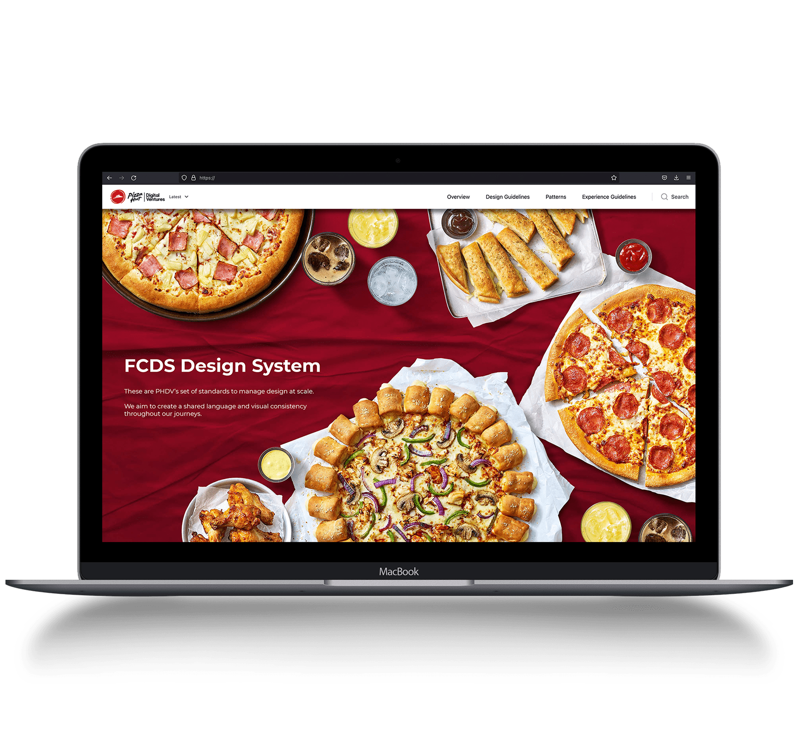
At Pizza Hut we had reached a stage where we had rolled out our digital store to several markets and each market was running on average 10 marketing campaigns per year. Keeping the markets on brand was a challenge – this is where we introduced our Marketing and UX Guidelines Website:
One source of truth to create visual consistency throughout our global journeys.

With the aim to provide global marketing teams with the knowledge and confidence to succeed on the Pizza Hut platform.

PROJECT

Marketing & UX Guidelines

CLIENT

Pizza Hut, YUM! Brands

MY ROLE

UX, Design, Copywriting & Research.

Steps to creating a successful

Marketing Guidelines Website
1

Audit

Much like any other project, my first step was to take inventory of all the marketing assets across Pizza Hut’s global territories.
2

Analyse

Once the audit was done and we had analysed the campaign performances of the markets we knew what to focus on.
3

Document

I documented everything the markets would need from how to approach photoshoots to typography, layouts & how to design for best results.
4

Central Location

Guidelines are only useful if the right people have access to it. We registered a new URL and built the custom website.
5

Market Broadcast

We then presented and rolled out our new guidelines to all the territories.
6

Keep Updating

This is not a static one-time product, the guidelines need to be continually updated.
MARKETING & UX GUIDELINES

Benefits:

1

Saves Time

2

Saves Cost

3

Increases Team Efficiency

4

Ensures Brand Consistency

MARKETING & UX GUIDELINES

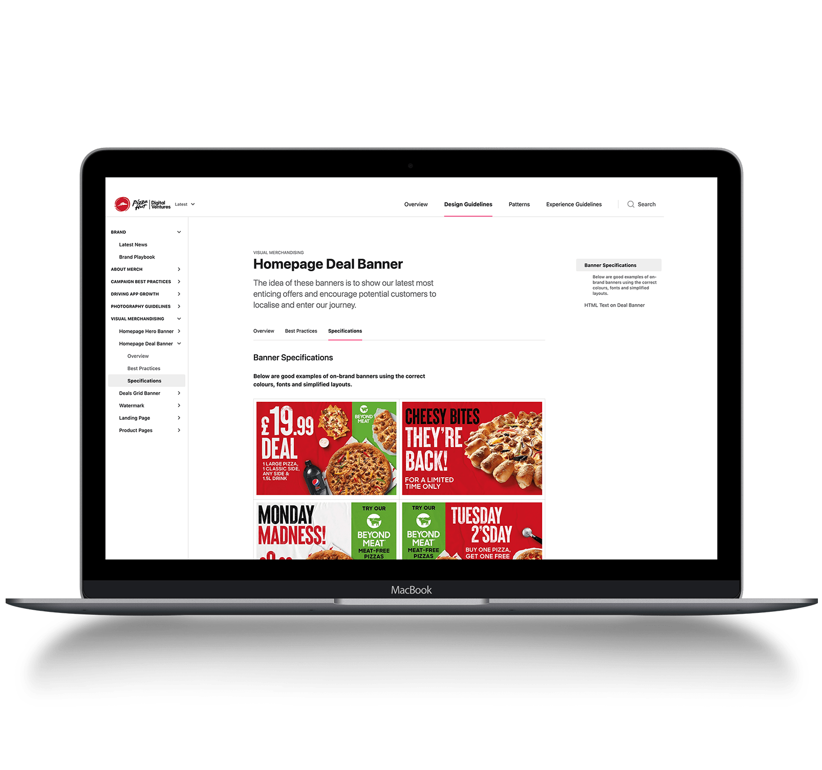
Topics Included:
1

Design Principles

2

Photography Guidelines

3

Downloadable Templates

4

Campaign Best Practices

5

Design Asset Specifications

6

Learnings From Other Markets

7

And more...

These guidelines ensure each design agency has the knowledge to build great looking, well performing and on-brand creative assets for all Pizza Hut markets.